- クライアント :
- ヤマカゲオードブル実行委員会
- プロデュース :
- みょーちゃん、遠藤伶
- アートディレクション、デザイン :
- 高松賢汰
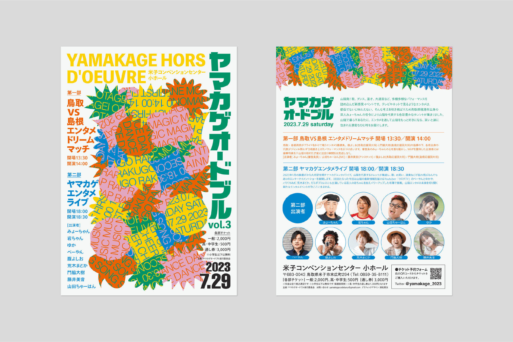
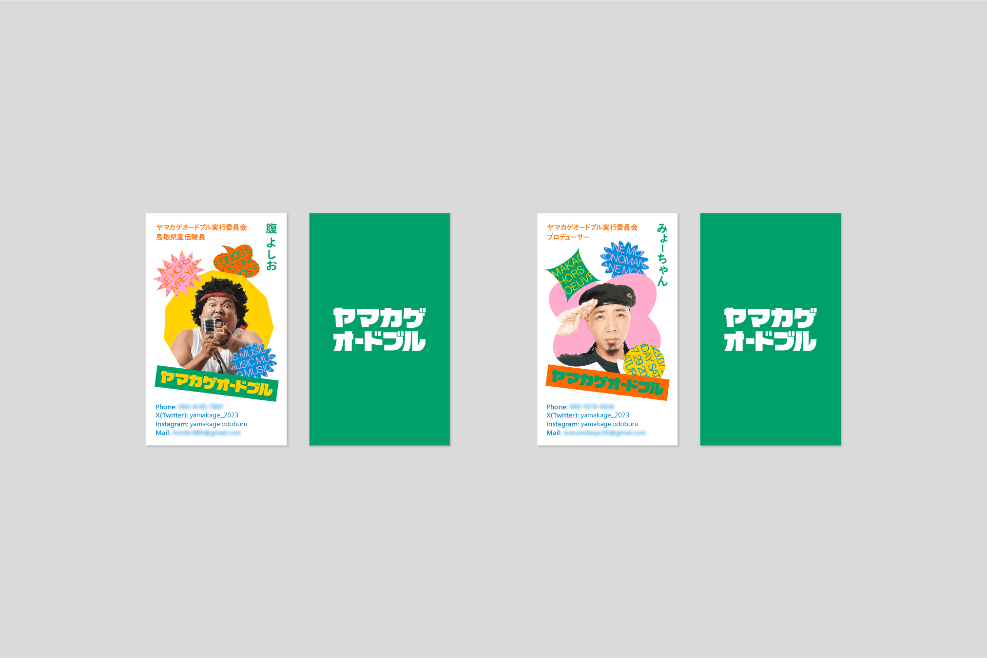
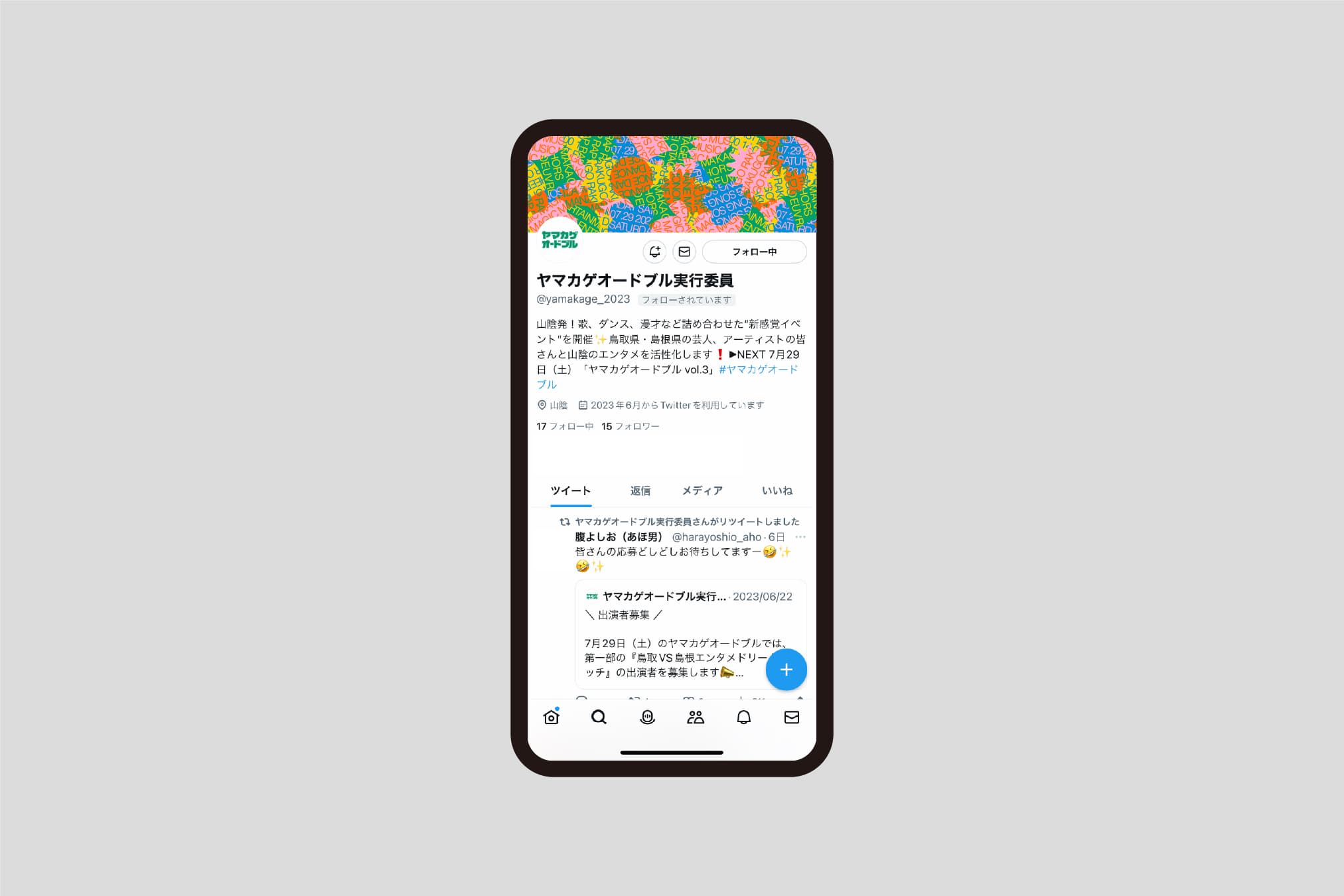
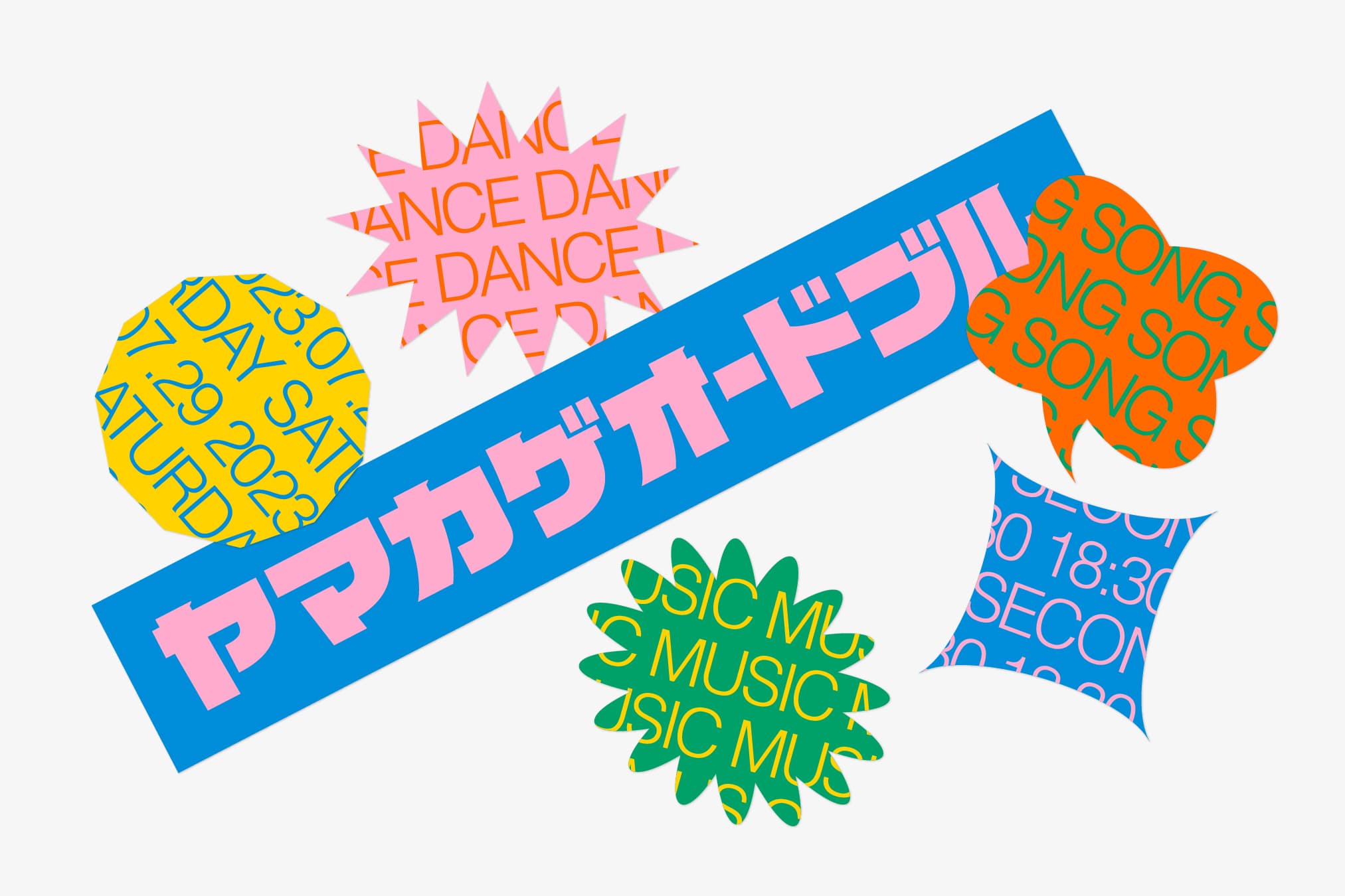
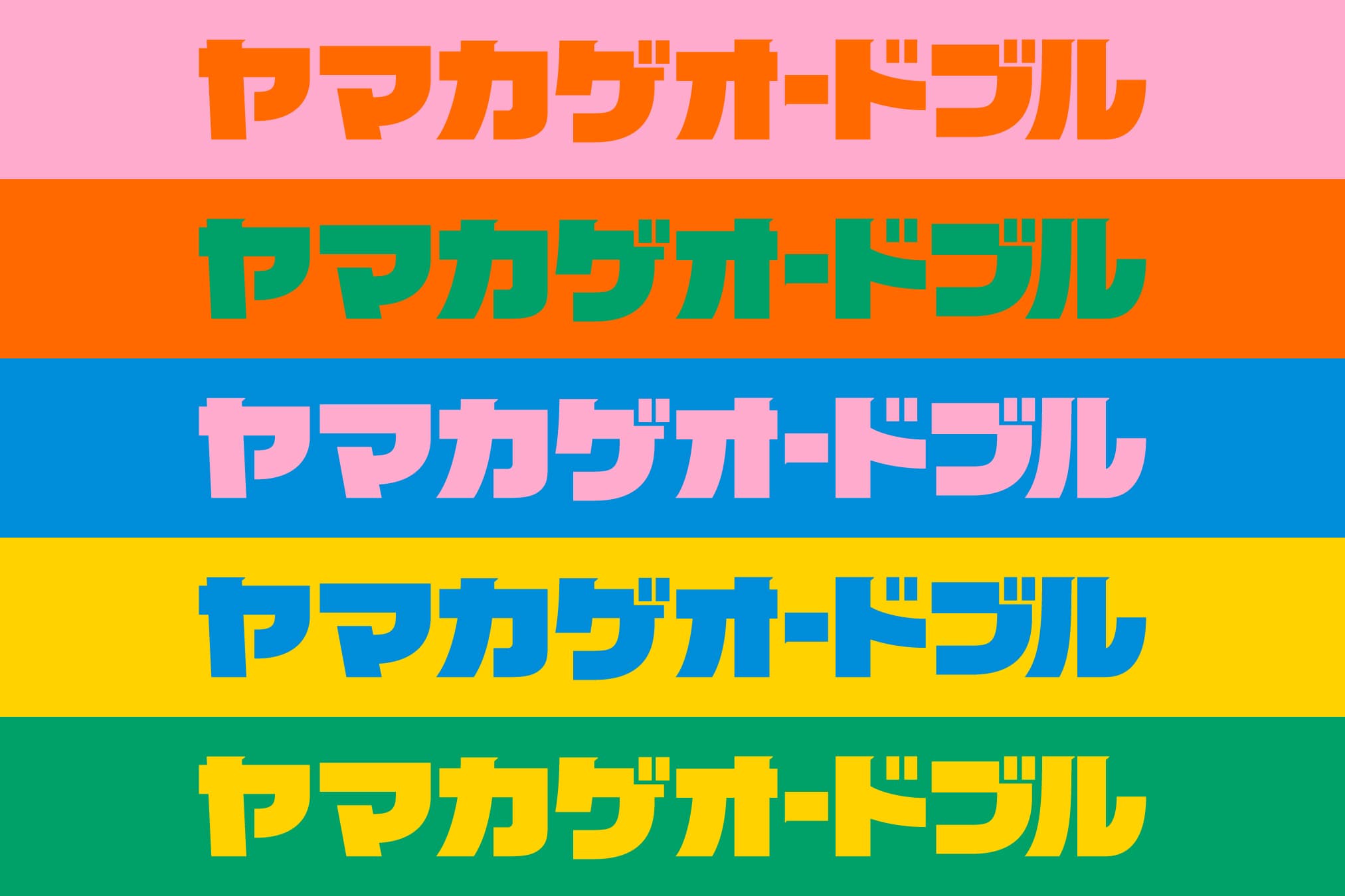
ヤマカゲオードブルvol.3のグラフィックデザインを担当しました。ヤマカゲオードブルは山陰発のエンターテインメントイベントで、若年層を中心に表現を披露する機会や、エンターテインメントに触れる機会を創出するために立ち上がりました。鳥取、島根の両県から選出されたエンターテインメントの才能が一堂に会するイベントのデザインとして、イベント名称にもある「オードブル」をデザインコンセプトの足がかりとしました。オードブルは大きな器に多様な食材の盛り合わせたものという印象がありますが、食材や彩りが仕切りによって整理されていることや、提供シーンや用途によって変化する食材や器の形といった、雑多さの中に存在する「まとまり」や「柔軟性」があることに気づきます。そこでヤマカゲオードブルも同様に、多様な個性を集合させたエンターテインメントイベントに相応しいグラフィックを目指しつつも「まとまり」や「柔軟性」を持たせることで、独自のアイデンティティを有したデザインになることを目指しました。イベントでの物販活動や、多様な媒体への展開を考慮すると、メイングラフィックには巨大で迫力のあるグラフィックではなく、単体での使用も可能な柔軟性を有したグラフィックの制作が有効であると判断し、複数のモチーフと文字からなる象徴的なグラフィックを一つにまとめることで「オードブル」とするVIを開発しました。ロゴは有機的で訴求力のあるメインビジュアルにシンボルの役割を委ねつつ、その中でも埋もれることがない力強いロゴタイプを制作しました。 I was in charge of the graphic design for Yamakage Hors d'oeuvre vol.3. Yamakage Hors d'oeuvre is an entertainment event originating in the San'in region, and was launched to create opportunities for young people to show off their expressions and experience entertainment. As a design for an event where entertainment talents selected from both Tottori and Shimane prefectures gather together, we used the "hors d'oeuvre", which is also in the event name, as a foothold for the design concept. There is an impression that hors d'oeuvre is an assortment of various ingredients in a large bowl. You notice that there is a "cohesion" or "flexibility" that exists. Therefore, Yamakage Hors d'oeuvre also aims to create a graphic that is suitable for an entertainment event that gathers diverse personalities, but also aims to create a design with a unique identity by giving it "cohesion" and "flexibility". I was. Considering the product sales activities at events and the development of various media, it is effective to produce a flexible graphic that can be used alone instead of a large and powerful graphic for the main graphic. We decided to develop a VI that would be an "hors d'oeuvre" by putting together a symbolic graphic consisting of multiple motifs and characters. While entrusting the role of the symbol to the organic and appealing main visual, we created a powerful logotype that does not get lost in it.