- クライアント :
- 株式会社CILHUB
- アートディレクション、デザイン :
- 高松賢汰
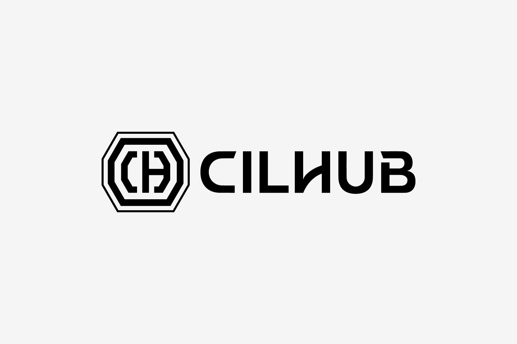
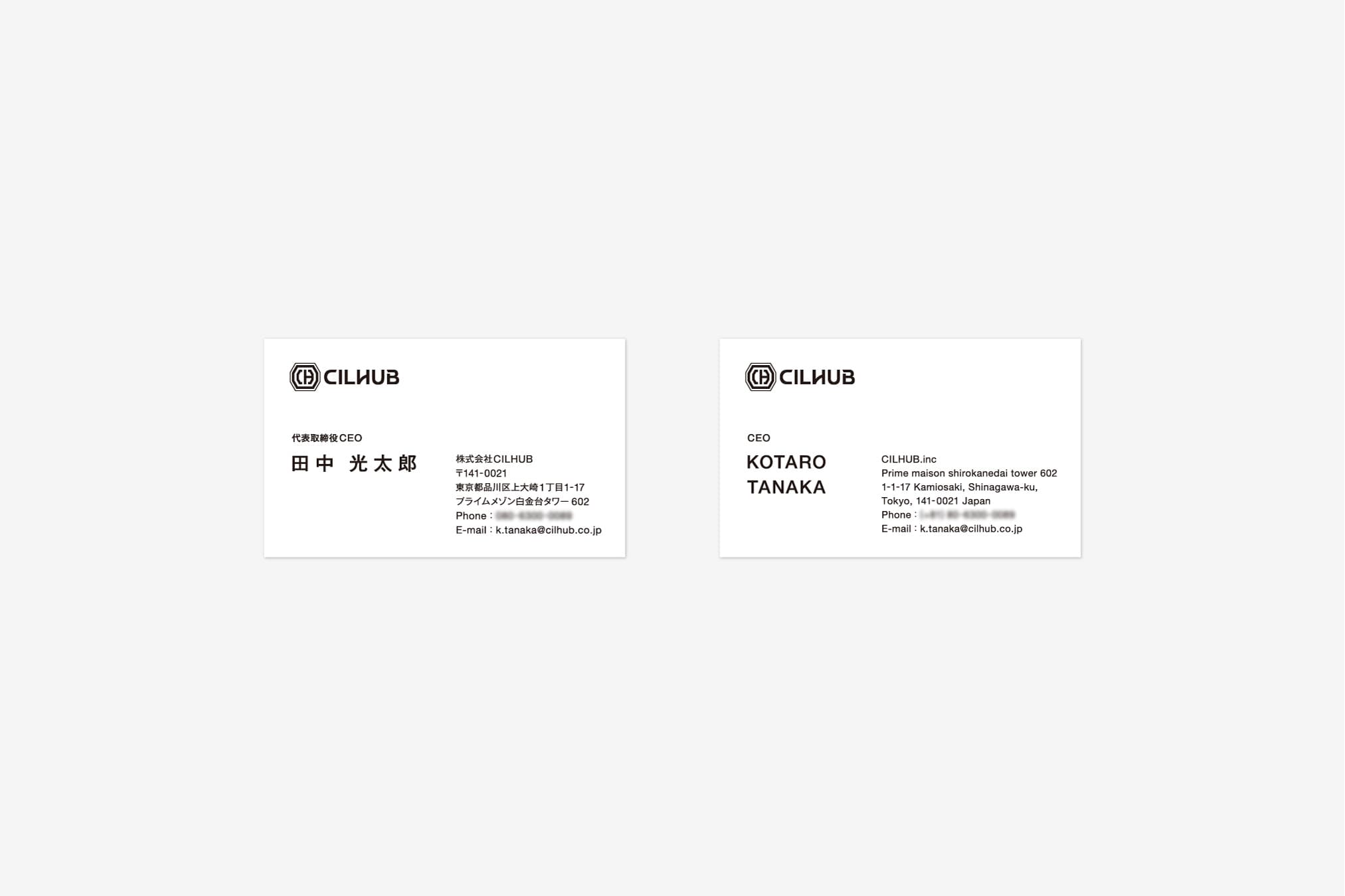
株式会社CILHUBのロゴ、および名刺デザインをKENPが担当しました。CILHUBという社名は「Challenge is life」の頭文字をとったCILと、その中心的な場所となる意味でのHUBを組み合わせた造語です。創業者である田中光太郎氏とのヒアリングを重ねるうちに、同氏にとっての挑戦は「掲げた目標を達成するという強固な意志と揺るぎない行動」であることが分かりました。制作したシンボルマークとロゴタイプにはこの意志を汲み取った力強さを取り入れています。 KENP was in charge of the logo and business card design for CILHUB Co., Ltd. The company name CILHUB is a combination of CIL, which stands for "Challenge is life," and HUB, which means the central location. After multiple interviews with the company's founder, Kotaro Tanaka, we learned that for him, a challenge is "a strong will and unwavering action to achieve the goals we set." The symbol mark and logotype we created incorporate a strength that reflects this will.